The Grid Edit pane provides a means of viewing and editing information related to the primary component being worked on. The number of columns and their names will vary, depending on what has been configured.
Feature |
Function |
|---|---|
|
Select New and select the desired component from the drop-down list to add to the pane.
If in-line editing is in force, a row is added to the bottom of the grid table and focus will be on the first editable cell in the row. The new row remains at the bottom of the grid until the grid is explicitly sorted or the pane is refreshed.
The New button can be replaced with an Upload button on some Grid Edit panes.
|
|
Select View to change the height of a row when a Thumbnail Display or Document Edit widget is present in the row.
Options include Small, Medium, and Large. The chosen height will be stored as part of the individual User Settings information. The View button may not be available even if a thumbnail image is present in the grid table.
|
|
Select Export to save the table grid to a specific storage device in the file format set by your site's configuration. The Export button may not be present on a Grid Edit pane.
|
|
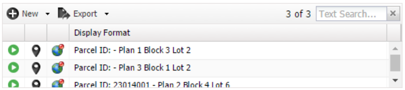
To filter the displayed list, enter search terms in the Text Search field. The count of items before the Text Search field indicates the number of items that are displayed in the list and the total number of items.
|
|
Even though changes are immediately visible, changes are not saved to the database until the Save button is selected.
|
 ,
, 
•To change the width of the columns on the table, place the pointer on the line between the column headings and drag when the pointer changes into the resize pointer. There is a minimum width setting for columns which cannot be overcome.
•To change the order of the columns, select a column heading and drag to the desired position. If Remember Grid Column Settings is selected, the order and width of the columns is stored in the User Settings. If Thumbnail Display or Document Edit widgets are present in the grid table, any change in view size (if permitted) will be stored as well. To change the order of the rows, select the column heading and choose  or
or  as desired.
Column |
Description |
|---|---|
|
Select the GoTo button to navigate to the presentation for that specific row in the Grid Edit pane.
•If a warning condition for the related object exists, a •If a •When a
|
|
Select the Edit button to edit the information for that row in a pop-up. •If a warning condition for the related object exists, a •If the related object has an error on it then a
Hovering the cursor over the row error icon displays the list of errors for that row (in addition to them showing in the Error List window).
The entire Grid Edit widget only appears in error status (with a red box around it) if there is a cardinality error (the wrong number of rows of a given type), which cannot be indicated on any single row in the grid.
NOTE: The ability to change the information on some Grid Edit panes may require authorization. If edit for a specific row is disabled, a
There are three possible edit modes for changing information on the Grid Edit pane:
This edit mode opens a pop-up window for editing. A pop-up window can be accessed by selecting the edit icon
The third edit mode adds new rows through a pop-up window and allows existing rows to be edited either directly in the grid or in a pop-up window. The pop-up window can be accessed by selecting the edit icon
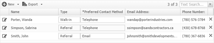
This edit mode allows any cell outlined with a gray box •If a warning condition for the related object exists, a •If a
|
|
Select the Locate button to view in a Locate Add-On the location associated with the selected objects.
This button is not visible if: •The Locate Add-On is not available OR •The pane has not been configured to display the button
|
|
Select the Delete button to remove items, if the account has sufficient privileges.
|
 icon is displayed for that row.
  icon is displayed, then the related object has an error on it that must be corrected before it can be saved.
  icon is displayed, navigation is disabled for that row.
 icon will be displayed for that row.
  icon is displayed and the error must be corrected before saving is possible.
  icon appears.
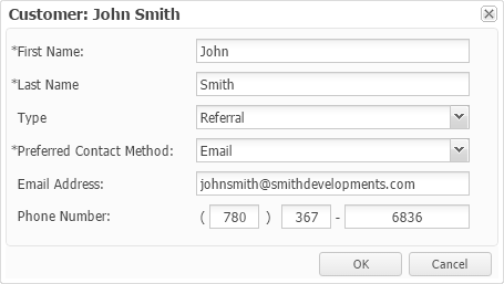
 to be directly edited with inline editing. There is no edit icon displayed in the first column of an inline edit grid.
  icon appears in place of the edit icon for that row.
  icon appears, then the related object has an error on it that must be corrected before saving is possible. Then, the cell with the error is also highlighted with a red box around it.
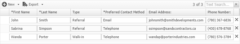
NOTE: A summary row may appear at the bottom of one or more columns, providing further information. It cannot be directly edited, but will update with changes to the values of edited columns.
File Upload
When the  button is present, selecting it opens the browser's File Upload window. (NOTE: Ctrl+I does not work for Grid Edit panes with an button, due to browser sand-boxing.)
Select one or more files in the File Upload window and selecting OK causes the File Upload for Related Documents pop-up window to open, showing the progress of the upload.
Dragging one or more files from an explorer window into the grid also opens the File Upload window, displaying the files as if the user selected the button.
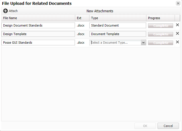
The File Name can be changed. The Ext (file extension) is set automatically and cannot be changed. If the Type column is present, it may be necessary to select how to relate the document. This must be done before the OK button is activated.
If there is an error with a file upload, the OK button remains inactive, and an error indicator appears in the Progress column.
1.Place the mouse over the message to see a more detailed description of the error.
2.Select the delete  icon to remove the file from the list if there is an error with the upload of a file.
3.Select Attach to select more files to upload using the browser File Upload window. One or more files from an explorer window can also be dragged into the grid.
NOTE:
•When the Grid Edit pane is located on a tab presentation, a Contents Exists indicator  might be displayed on the tab when the grid table contains items.
•Only the first Grid Edit, Multi Select, or Notes Edit pane on the tab presentation (as determined by tab order) is evaluated for the Contents Exist indicator. A Warning indicator takes precedence over a Contents Exist indicator.
•Grid Edit panes do not necessarily permit editing. If that is the case, the icon beside the check box on each row is the navigation icon, and selecting on it will go to a page showing the object the row is for. If the row object does not have a presentation (or has one that is not readable by the current user), there will be no icon at all in the grid for that row.
•Navigating to a different page causes a warning about any unsaved changes. A warning also appears if there are any unsaved changes when the  button is selected.
•Selecting and the OK button in the warning pop-up can be used to discard any changes that have been made on the page and returns it to its initial retrieved state.