The following widgets are available in StaffUI. The images are representative only; the actual appearance at your site will probably be different.
Widget |
Features |
|---|---|
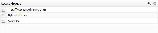
Access Group Select |
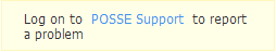
The Access Group Select widget might appear on the presentation for a POSSE user. It displays the access groups to which a user belongs.
Select the
The list of access groups can be filtered by entering search terms in the Text Search... field below the title bar.
An indicator tells you how many access groups are displayed and the total number available. Select or clear the check box to add or remove assignment to an access group.
|
Block Text Edit |
The Block Text Edit widget allows text to be entered (if it is not read-only). It can fit: •Into an envelope window •Onto a label •Into a fixed-size area of text on a printed form
Consult with your configuration specialist to increase the width of the widget if text starts to wrap at the end of a line or is truncated below the bottom of the widget.
|
Complex Select |
The Complex Select widget combines the functionality of a Multi-Select widget with that of a Related Grid widget. It provides selection of objects across multiple relationship definitions and provides edit capabilities for Dynamic Details that are defined on the relationship.
•If there is only one relationship defined for the Complex Select widget, the related item description does not display the relationship label. •If a presentation has not been defined for a related item then the Navigate icon is not displayed. The Warning Navigate •If the related item has an error on it, a
Column movement works as follows: •Any dynamic detail columns on the widget can be resized and moved. •The column that displays the description of the related object cannot be moved. •The first three columns (four if the object icon is present) cannot be moved or resized. •Select a column heading to change the sort order.
The following actions can be performed: •Select the check box beside an item to make the Remember and Clear buttons available. •Select the Remember button to store references to the selected objects. This replaces any references that are currently stored. •Select the Clear button to remove the relationship to the object. Any associated Relationship Dynamic Details are deleted. •Select the
The Relationship column provides a drop-down list to select the appropriate relationship definition to the related object, if more than one is available. If you do not select one of the relationship options from the drop-down list, that object will not be related.
Select OK to proceed with adding the items that don't have a problem indication, or select Cancel to make any needed corrections or abandon the addition.
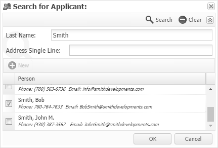
Select Search to search for the applicable related object. The number of entries that are visible in the drop-down list depends on the number of relationships and on the specific security privileges that have been set up.
Only one type of related object can be searched for at a time. If only one relationship has been configured, selecting Search opens the Search pop-up window immediately.
NOTES: •If a new related item is added into a Complex Select widget and it has not yet been saved to the database, it displays a •If a Single Select search layout is configured for the related object, the Single Select search pop-up window appears. If a Multi Select search layout is configured, then a Multi Select Search pop-up window (see example above) appears.
|
Date Time Edit |
The Date Time Edit widget is normally read-only, with the date and time set by the software. On the Process panel, the Actual Start and Actual Completed fields may be available for entering a value.
Selecting a date using the calendar pop-up window (selecting the calendar icon on the right side of the widget), causes the time to default to 00:00:00, which can be manually changed. The time is considered to be the time in the current time zone.
|
NOTE: For Document Edit widgets on grid panes, see below.
The widget itself can have a title. At the right side of the title bar is the Upload
NOTE: To permanently store the uploaded document, select
Button Visibility •If the document is not read-only, the appropriate privileges are in place, and the current document revision is not locked, the Upload button is available. •If the widget is managing a related document, the Delete •If the Delete button is visible, it is always disabled if more than one revision exists on the document. In this case, navigate to the document itself to delete it. In the body of the document edit widget, the document icon is followed by the Download If an upload has been done but the
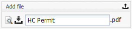
To the right of the Download button is the file name, which can be changed (256 characters maximum) if: •The document is not read-only •The appropriate privileges are in place.
Last is the file extension, which cannot be changed here.
The document edit widget has a different appearance, depending on what is happening to the document with which it is associated. The following six different states can be encountered:
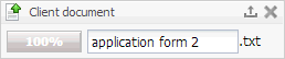
State 1. New document with nothing uploaded:
The state before a document exists. The Title (if configured) appears in the title bar, as does the Upload
Selecting Upload opens the browser's standard File Open dialog, allowing a file to be uploaded.
When a file is chosen and OK is selected in the File Open dialog, the file name and file extension are validated (only certain file types are allowed). If they pass validation, they are placed into the appropriate places. Then the widget will enter State 2. If you cancel in the File Open window, nothing changes and you are back at the beginning.
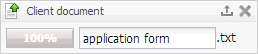
State 2. Uploading the first new document:
In this example, the file name and the extension have been filled in by the File Open dialog. That file is currently being uploaded, as the progress bar and upload statistics indicate — they occupy the space where the thumbnail and Download button usually appear.
The file name can be modified during the upload, if necessary. The Upload (and, if applicable, Delete) buttons are not available while the upload is in progress.
If the upload succeeds, the widget enters State 3. If an error occurs during the upload, the widget is outlined in red and a pop-up message appears.
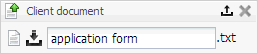
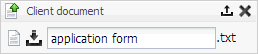
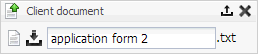
State 3. The first new document has been uploaded but not yet saved:
The upload of the new document has succeeded, and is now in the "holding" area, but it has not yet been saved to the database. The thumbnails and image information have been produced, so the thumbnail (or file extension icon) can be displayed instead of the progress bar. The Download button is available. As before, the file name can be modified.
Two options are available: •Select Upload again to open the File Open dialog (just as in State 1) •Select OK to upload the new file. The displayed file name and extension are replaced with the name and extension of the new file.
If the upload succeeds, the previously uploaded document is discarded in favor of the new one. If the user cancels in the File Open dialog the originally uploaded document still exists in the holding area. Select •If no valid file name has been entered, a numerical one is provided. •If no valid document has been provided, the widget is outlined in red and a pop-up error message appears. When the save operation completes successfully the widget enters State 4.
NOTE: Navigating away from this page before saving causes a warning that pending outstanding changes exist. Accept or discard an uploaded document as needed.
State 4. A saved document exists:
The document exists in the database. The appropriate thumbnail image appears at the left, followed by the Download button. If the widget is not read-only, the file name can be changed and the Upload button is available. The Delete button, if applicable, is available depending on security permissions).
The Download button presents a standard File Save dialog, where a file path can be chosen for the current version of the document to be saved to the local disk.
The Upload button performs the identical function that it did in State 1, except that the widget will enter State 5 instead of State 2 (and State 6 instead of State 3).
Selecting the Save button at the top of the presentation causes standard Save processing to occur. Assuming a valid file name has been provided, the document is updated with the new file name.
NOTE: Navigating away from this page before saving causes a warning that pending outstanding changes exist if the file name was changed. Accept or discard an uploaded document as needed.
The Delete button is used to delete the document. Selecting Delete causes the widget to enter State 1.
State 5. Uploading changes to an existing document:
The same as State 2 except that successful completion leads to State 6 rather than to State 3. The name taken from the file that is being uploaded replaces the existing base name and extension.
State 6. Uploaded changes to an existing document that have not been saved yet:
The same as State 3. Selecting Delete places this widget into State 1. NOTE: The file name and possibly the extension may have changed, as they were set to the file name chosen by the user in the File Open dialog in State 4. The Delete button (if applicable) is not available in the following situations: •If there are multiple revisions of the document. •If security privileges to delete the document aren't in place. •If the widget is read-only.
When the Document Edit widget appears on a grid pane, it does not have a Delete button. That functionality is handled by deleting the row using the standard controls on the grid.
•The Upload button is only visible when the user is editing the row in-line (not in a pop-up edit window). •The Upload button is not available while the upload is occurring.
|
|
Domain Combo Box |
Provides a drop-down list of choices based on a configured list of values. Similar in appearance to a Relationship Combo Box.
|
Event Audit Report Link |
Opens an Event Audit report in .pdf format in a new tab or window, depending on your browser settings.
|
Existing Object Link |
Opens a page displaying the specified object or job, if the proper security permissions are in place.
These links can be bookmarked. The icon and link text provide an indication of the link's purpose. If the label is dimmed, the link is not active.
|
External Link |
External links provide a means to open another browser page using a stored URL reference.
This allows for: •Bringing up source sites for standards, regulations, and other materials. •Navigating to third-party sites in context of the current process.
The icon and link text provide an indication of what the link is for.
|
Hierarchy Grid |
A Hierarchy Grid widget provides an expandable tree view of objects in StaffUI. This widget can be set up in the configuration software to initially display as collapsed or with the first level expanded.
Icons •Black icons can be interacted with; items with dimmed icons cannot, except for expanding or collapsing them. •Items marked with •Select the
•Select Delete •Select
|
Image Display |
Shows the complete image (not a thumbnail), but the image may be scaled down with its aspect ratio preserved. The image display widget is never available on grid panes and is always read-only.
|
Provides a read only means of displaying levels of importance for jobs and the processes in a grid column. The levels of importance are as follows: • •
|
|
Provides a means of selecting a different level of importance for any job or process. The levels of importance that can be selected from this widget are: • •
|
|
Instructional Text |
Provides a means of presenting formatted text blended into the presentation for in-line guidance and other informational requirements.
The text can be configured to display in a number of different colors. The background color cannot be changed.
|
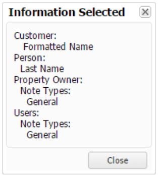
Keyword Criteria |
Used for keyword searching on multiple component types. The Keyword Criteria widget is recognized by the Information button to its right.
When doing keyword searches, avoid using short words, because the search performs very slowly and returns a large number of results. Each word that is entered is considered to have a "wild card" at the end, so entering "contractor" also finds "contractors," but not "contract".
To see a list of the component types that are included in the search, select the Information button. A read-only Information Selected pop-up window appears, listing the included components in alphabetical order.
The Information Selected pop-up window can be repositioned and resized to suit individual preferences.
Any changes to the position and size can be stored in your User Settings. Select either Close button or press Esc to dismiss the pop-up window.
|
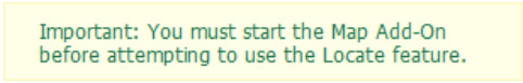
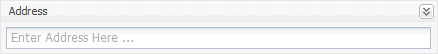
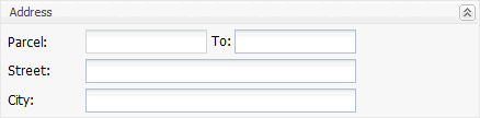
LMS Address Criteria |
Initially appears collapsed on the Search Panel when it is available.
To start the address search, enter the desired search terms and select To expand the widget and display the advanced search criteria entry fields, select
Switching between the expanded and collapsed views of the widget does not discard any search criteria already entered on the hidden view, until the
|
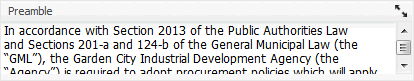
ML Text Edit |
Provides a way of editing large amounts of text. Select the expand arrows
A Clauses... button may be visible on the ML Text Edit widget, depending on whether clauses have been configured for the widget. The button is not available if the pane or presentation is read-only.
Select Clauses... (or press Ctrl+L) to open the Select Clauses pop-up window. Here, double-click a clause or select the Apply image
Filter the list of clauses by entering search terms in the Text Search field below the title bar. An indicator shows how many clauses are displayed and the total number that are available.
The clause is added at the cursor position and the cursor moves to the end of the applied clause.
More than one clause can be applied before closing the Select Clauses pop-up window. The Select Clauses pop-up window can be repositioned and resized to suit individual preferences. Any changes to the position and size can be stored in the User Settings. Select Close when done adding clauses.
When the ML Text Edit widget appears in a row on a grid table, it is always read-only.
|
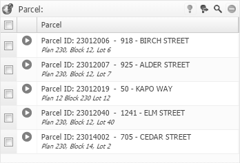
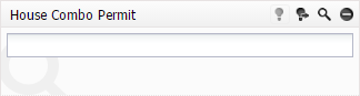
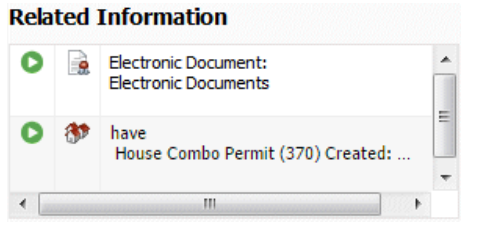
Used to search for and display related objects.
If there are insufficient privileges, the widget: •Is empty •Shows a limited number of different items •Is read-only •Shows that none or only some of the buttons are active.
The navigate icon may be yellow
•To store a reference to the selected objects, select the •To add the currently referenced objects to those already related, activate the oSelect OK to proceed with adding the items that don't have a problem indication. oSelect Cancel to make any needed corrections and/or abandon the addition. When a parent job or sub-job in a job hierarchy is added, the job hierarchy will be maintained.
To remove a related object from the Multi Select widget: 1.Select the row. 2.Select the 3.Select the
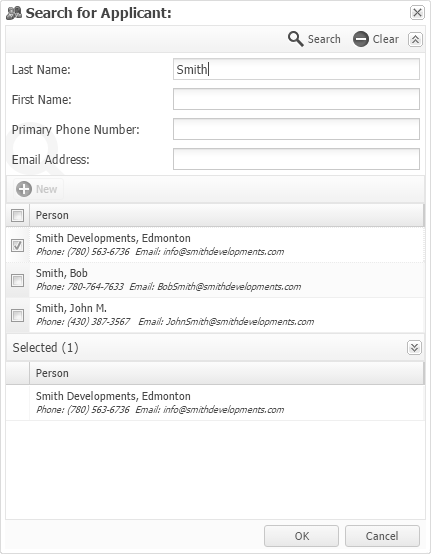
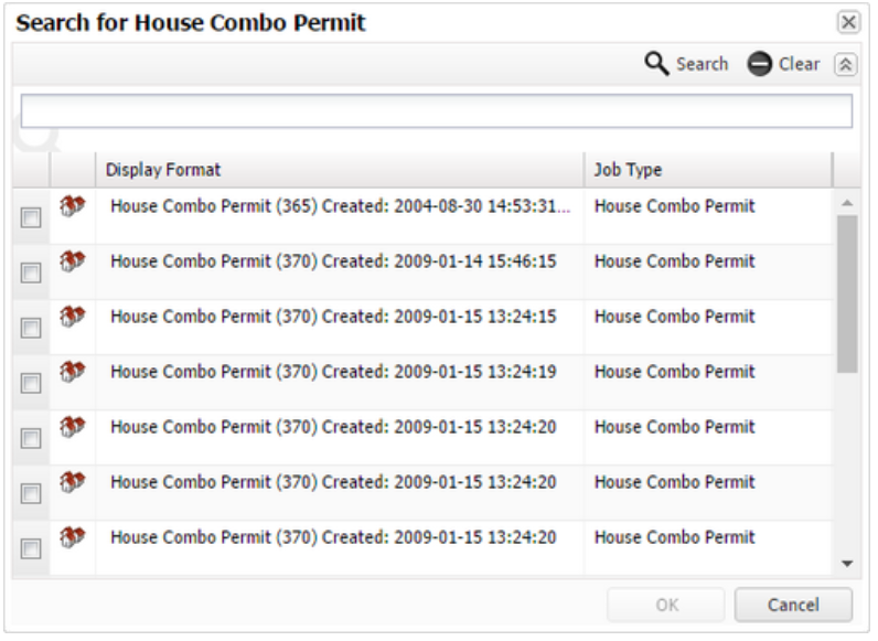
Select the Search
Enter the search criteria and select
The Multi Select Search pop-up window can be repositioned and resized to suit individual preferences. Any changes to the position and size of the pop-up window as well as the width and order of the columns in the Results and Selected grid table of the pop-up window can be stored in the User Settings.
NOTE: The column width for the Results and Selected grid table remain synchronized. A change in one causes an identical change in the other. Clear the check box for an item in the results list and select OK to remove the relationship between the displayed object and the component on which the widget sits, removing the row from the Result list (if permitted).
When the Multi Select widget is located on a tab presentation, a Contents Exists indicator
NOTE: If a new related item is added into a Multi Select widget and it has not yet been saved to the database, it will display a
|
|
New Object Link |
Opens a new job or object page, depending on what is configured. It is found only on menu pages.
The page can be opened in a new tab or window, if necessary. The icon and link text provide an indication of the link's purpose.
|
New Related Object Link |
Opens a page for a new object related to the current object. If there are unsaved changes on the current page, a prompt appears to save or discard them before navigating to the new page.
The page for the new object related to the current object can be opened in a new tab or window, if necessary. The icon and link text provide an indication of the link's purpose.
|
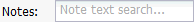
Note Criteria |
Provides a text entry field for search terms related to Notes. The length of the text entry field and displayed text may be different from what is shown in this example.
A Notes search looks for all components that have notes containing every search term entered in the Note Criteria widget. The search results may be restricted to certain note types, depending on what has been configured.
|
Provides search, navigate, and recall functionality for attaching a job to a parent job, thereby making the attached job a sub-job.
The Parent Job Select widget can only appear on a job presentation and may not be present. It behaves and looks similar to the Single Select widget. The search criteria are restricted to the external file number (normally seen in the header of jobs) or the external ID of jobs.
If a parent job has already been related to the current job, a
Select
Select an item in the Result table, then select OK. Or select Cancel to return to the job presentation.
The Search pop-up window can be repositioned and resized to suit individual preferences. Any changes to the position and size of the pop-up window can be stored in the User Settings. The width and order of the columns in the Result grid of the pop-up window cannot be changed, but one column can be hidden. Select
|
|
Password Confirm |
Provides a means to change the user's password. An error message appears if the two entries are not identical. Select
|
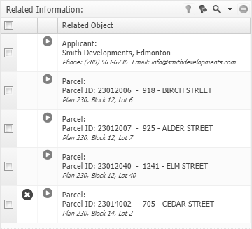
Related Information Display |
Provides in one widget a read-only display of a variety of existing related object types (depending on sufficient user privileges). If only one type of related object is allowed, the relationship designation is not present.
A title above the widget is not present if one has not been configured. The option to display the object type icon is also set by configuration.
If it is not possible to navigate to the related object, the navigate icon is not present. If there is a warning present on the related object, the warning navigate icon will appear, if configured to do so. If there is a warning present on the related object and it is configured to display, but the object cannot be navigated to, the warning icon will appear instead of the warning navigate icon.
|
Relationship Combo Box |
Provides a drop-down list of business objects for selection. Similar in appearance to a Domain Combo Box.
|
Report Link |
Opens a Reports pane that provides the ability to run the report.
A report criteria pop-up may display, allowing criteria settings to be entered for the report.
NOTE: Any criteria that are entered are only for reporting purposes. Values do not change on the source object itself. Reports are generated in .pdf format and appear in a new tab or window, depending on individual browser settings.
If the report is restricted to one revision and that revision already exists, another cannot be generated. If there are unsaved changes on the page, a message says to save them before running the report. The icon and link text provide an indication of the purpose of the link. The Report Link widget can appear on a menu page or on an object details pane.
|
Search Link |
Opens the Search panel in preparation for finding objects. The icon and link text provide an indication of what the link is for.
|
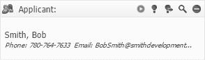
Displays information about a related object. If the user does not have sufficient privileges, the widget will be empty or read-only and none or only some of the buttons will be active.
Navigate to the object by activating the
•To store a reference to a related object, select the •To relate the currently referenced object, select the
Select the
Enter the search criteria and select
The Single Select Search pop-up window can be repositioned and resized to suit individual preferences. Any changes to the position and size of the pop-up window as well as the width and order of the columns in the Results grid of the pop-up window can be stored in the User Settings.
If a new related item is added into a Single Select widget and it has not yet been saved to the database, it displays a |
|
Sub-Menu Link |
Opens a page with more links. It is found only on menu pages. This link can be recognized by the stack of three short, dark lines on the right. The icon and link text provide an indication of the link's purpose.
|
Sub-Pane |
When visible, acts as a border for grouping similar items. The items displayed in the widget might be details on a related object type.
|
Text with Existing Object Link |
Does not have an image and is surrounded by a cream-colored background. The text, which can appear before and/or after the actual link, can vary in color and provides guidance on the link's purpose. It is usually associated with help text.
Otherwise the Text with Existing Object Link widget behaves just like the Existing Object Link widget described above.
|
Text with External Link |
Provides a way to open another browser page using a stored URL reference.
This widget allows the user to bring up source sites for standards, regulations, and other materials, as well as navigate to third-party sites in context of the current process.
The text provides guidance on the link's purpose. This link widget does not have an image and is surrounded by a cream-colored background. Otherwise the Text with External Link widget behaves just like the External Link widget described above.
|
Text with New Object Link |
The text, which can appear before and/or after the actual link, can vary in color and provides guidance on the link's purpose.
The link part of the text appears in the normal link color. Otherwise the Text with New Object Link widget behaves just like the New Object Link widget described above.
|
Text with New Related Object Link |
The text, which can appear before and/or after the actual link, can vary in color and provides guidance on the link's purpose.
The link part of the text will appear in the normal link color. Otherwise, the Text with New Related Object Link widget behaves just like the New Related Object Link widget described above.
|
Text with Report Link |
The text, which can appear before and/or after the actual link, can vary in color and provides guidance on the link's purpose. The link part of the text appears in the normal link color. Otherwise the Text with Report Link widget behaves just like the Report Link widget described above.
|
Text with Search Link |
The text, which can appear before and/or after the actual link, can vary in color and provides guidance on the link's purpose.
The link part of the text appears in the normal link color. Otherwise the Text with Search Link widget behaves just like the Search Link widget described above.
|
Consists of a display area on the left and a Download
The Download button beside the thumbnail can be used to download the most recent version of the associated document. It does not simply display the full image in the browser.
|
 icon in the title bar to open a pop-up window where you can specify access groups the user should or shouldn't belong to (if you have sufficient privileges). The Result table displays all the access groups available, except the Public access group, which is always selected.
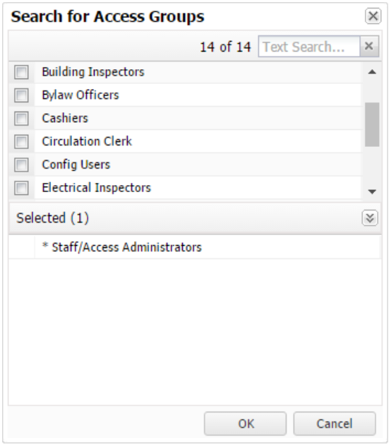
 icon is displayed when appropriate (if configured). Some items might not be visible if security privileges prevent that.
  icon appears in the column to the left of the navigate icon.
 button to add the currently referenced objects to those that are already related. A special Recall Confirmation pop-up window (that includes a Relationship column) may appear, indicating problems with the desired additions.
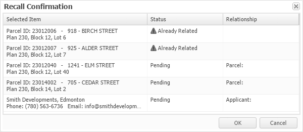
 disabled navigate button instead of a
 button. It allows a document to be uploaded to the database to replace the current document, if any. Multiple files are not allowed. Files can also be dragged and dropped onto the widget to upload them.
  at the top of the pane.
  button is visible.
  button. The
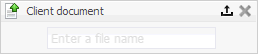
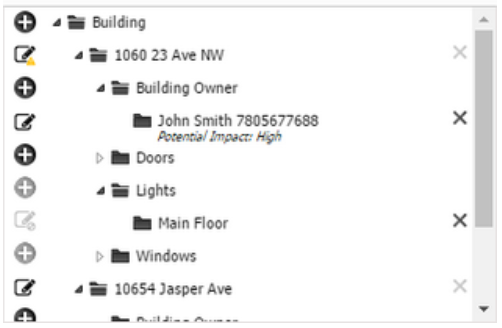
 can be expanded. Those marked with
  can be collapsed.
  icon to open a pop-up edit window used for creating a new object. The new item appears at the appropriate position in the hierarchy.
  to delete an item (and, normally, all of its children, if any).
 to open a pop-up window used for changing or examining information about the item. A warning icon
  may be visible instead. Save changes to keep them.
 High
High Extreme
 .
. 
 to open a larger window for editing. When the window is expanded, select
  to add the clause to the widget.
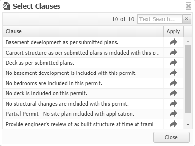
 button. This replaces any currently stored references.
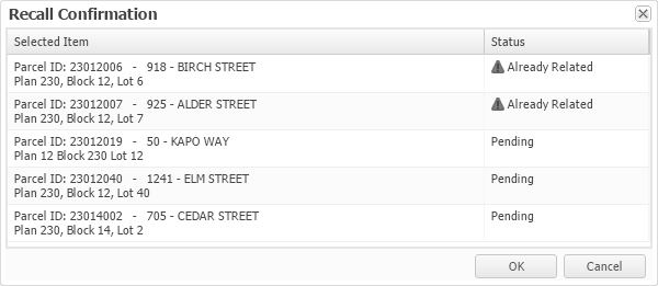
 button in the title bar.
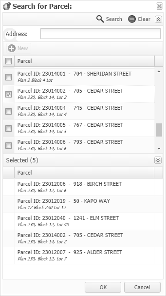
 to remove all search criteria.
  might be displayed on the tab when the table grid contains items.